plot
crystal.plot contains functions for plotting clusters.
Plotting functions for Clusters.
Note that some visualizations work best with datasets that have fewer samples while some are more informative with more samples.
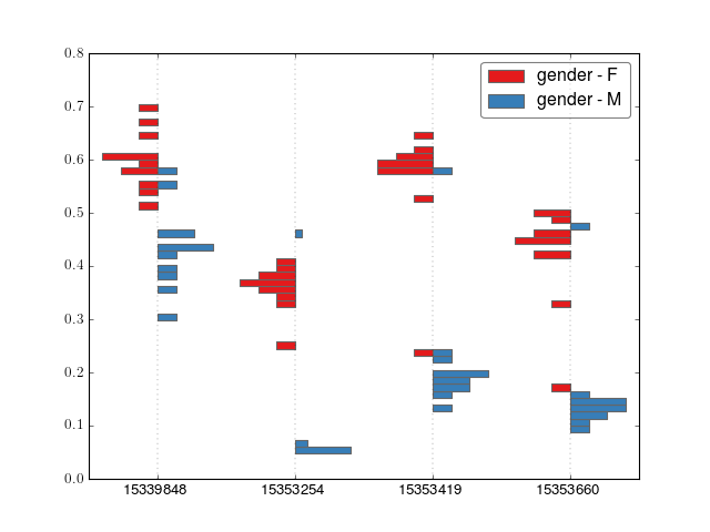
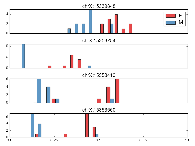
- crystal.plot.barplot_cluster(cluster, covs, normed=False, n_bins=50)[source]
Make a barplot of a cluster. Only works for 2-class data, e.g. gender or case-control
>>> import crystal
>>> import crystal.utils as cu
>>> covs, cluster = cu.real_cluster()
>>> formula = "methylation ~ age + gender"
>>> c = crystal.wrapper(crystal.zscore_cluster, formula, cluster, covs, "gender")
>>> crystal.plot.barplot_cluster(c, covs)
(Source code, png, hires.png, pdf)
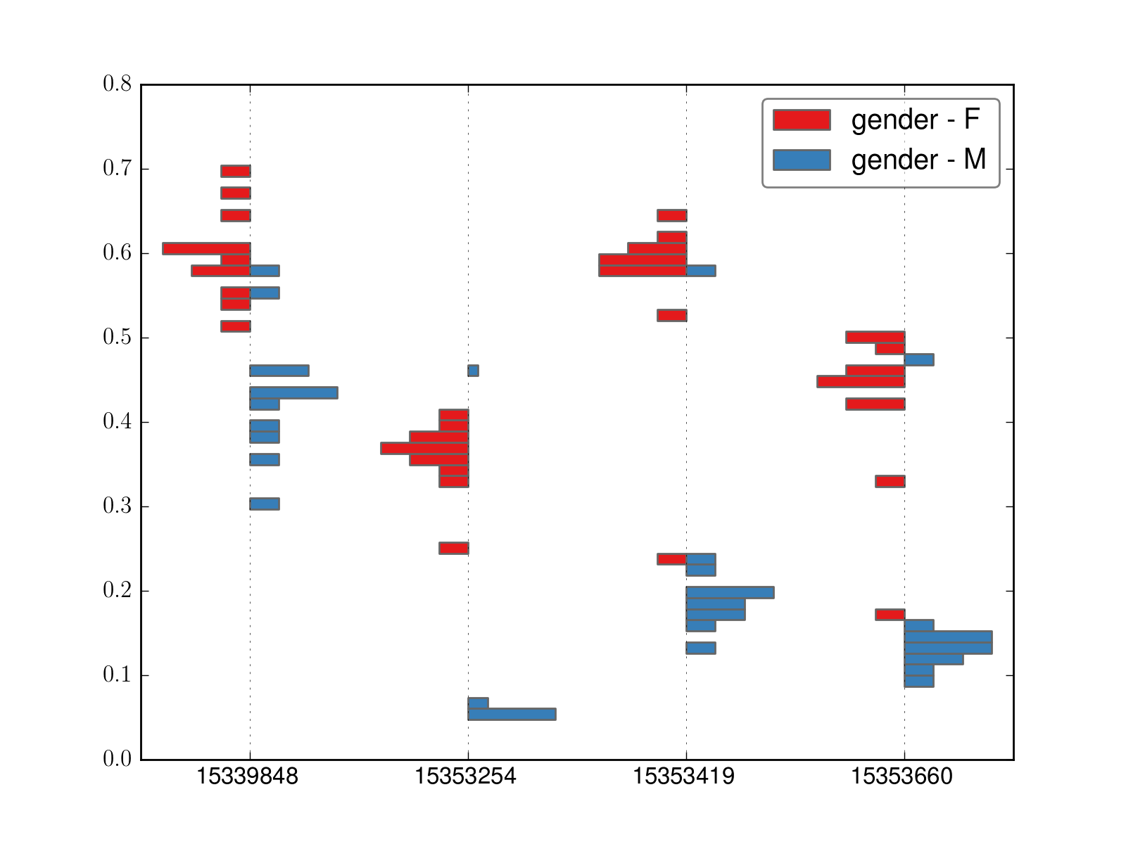
- crystal.plot.factorplot_cluster(cluster, cov, palette='Set1', ilogit=False)[source]
Create a factor plot.
>>> import crystal
>>> import crystal.utils as cu
>>> covs, cluster = cu.real_cluster()
>>> formula = "methylation ~ age + gender"
>>> c = crystal.wrapper(crystal.zscore_cluster, formula, cluster, covs, "gender")
>>> crystal.plot.factorplot_cluster(c, covs)
(Source code, png, hires.png, pdf)
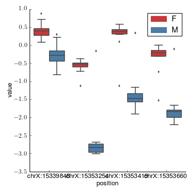
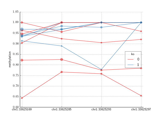
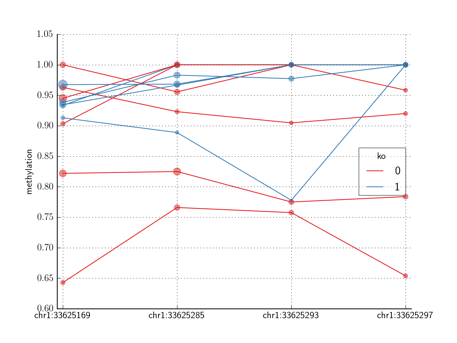
- crystal.plot.plot_cluster(cluster, covs, normed=False)[source]
Plot a cluster (output from crystal.model_cluster)
Plot will vary depending on if cluster[‘var’] is dichotomous or continuous.
>>> import crystal
>>> import crystal.utils as cu
>>> covs, cluster = cu.real_cluster()
>>> formula = "methylation ~ age + gender"
>>> c = crystal.wrapper(crystal.zscore_cluster, formula, cluster, covs, "gender")
>>> crystal.plot.plot_cluster(c, covs)
(Source code, png, hires.png, pdf)
We will get a different plot if the cluster is a continuous variable.
- crystal.plot.spaghetti_plot(cluster, cov, ax=None, ilogit=False, palette='Set1')[source]
- Create a spaghetti plot of a modeled cluster. This is best when the
- number of samples is less than about 20. Otherwise, use plot_cluster()
>>> import crystal
>>> import crystal.utils as cu
>>> covs, cluster = cu.real_count_cluster()
>>> covs.head()
>>> formula = "methylation ~ ko"
>>> c = crystal.wrapper(crystal.zscore_cluster, formula, cluster, covs, "ko")
>>> crystal.plot.spaghetti_plot(c, covs)
(Source code, png, hires.png, pdf)

Note
in the case of CountFeature as from sequence data, the points are sized by the sequencing depth.